Artwork Guidelines and Helpful Tips
You worked hard designing the perfect label, the last thing you want is to pick up the finished product only to see a blurry image or pixelated graphic. Help is here! Follow these instructions and helpful hints for high-resolution, high-quality printed labels:
Acceptable File Formats for Image Uploads:
Maestro Label Designer file formats: .jpg / .jpeg / .gif / .png / .pdf
Recommended Image Settings:
Resolution: 300 dpi (more info)
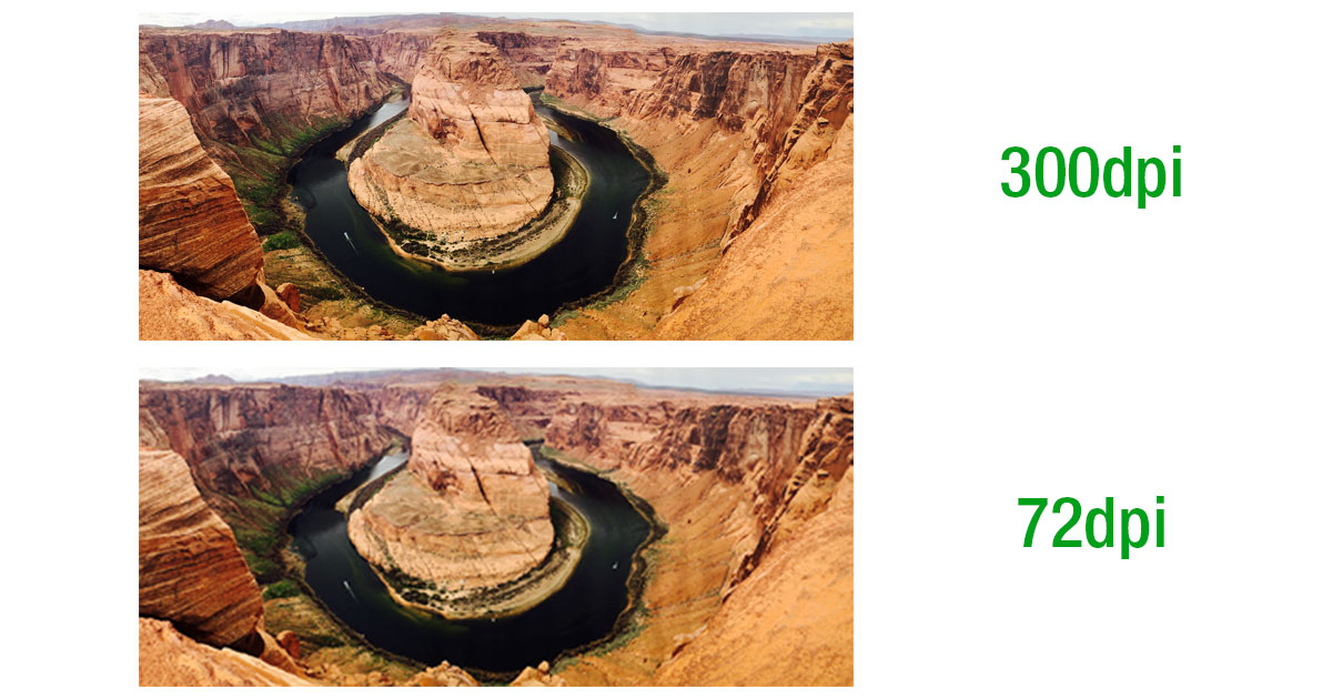
The resolution of your file refers to its number of dots per inch (dpi). The higher the resolution, the more details you can discern from your file.
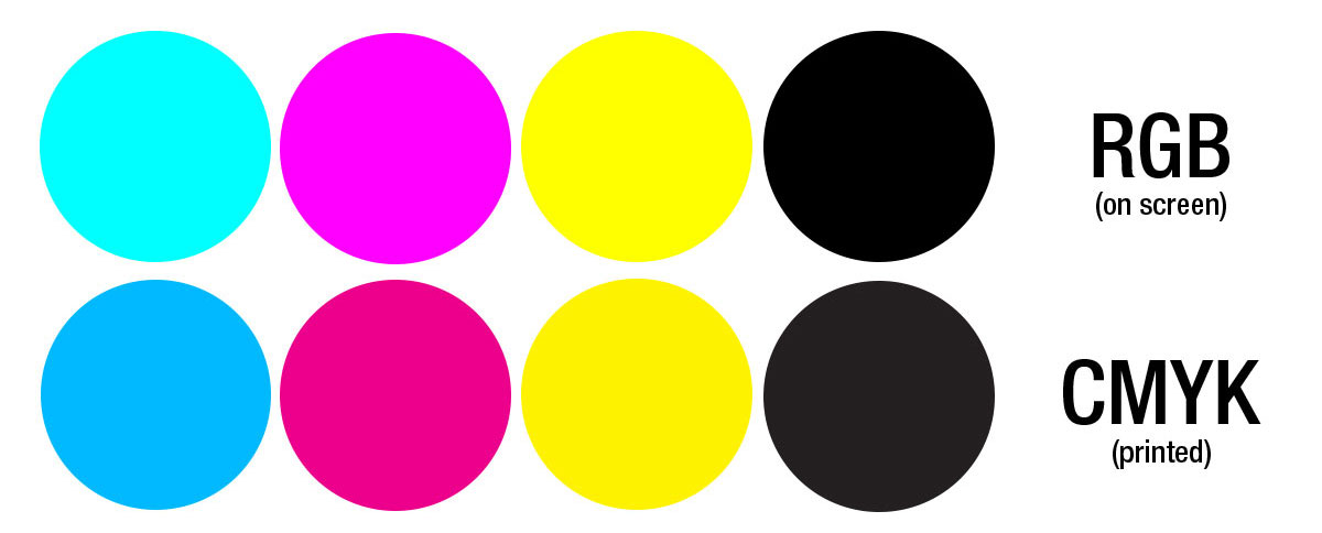
Colour mode: CMYK (more info)
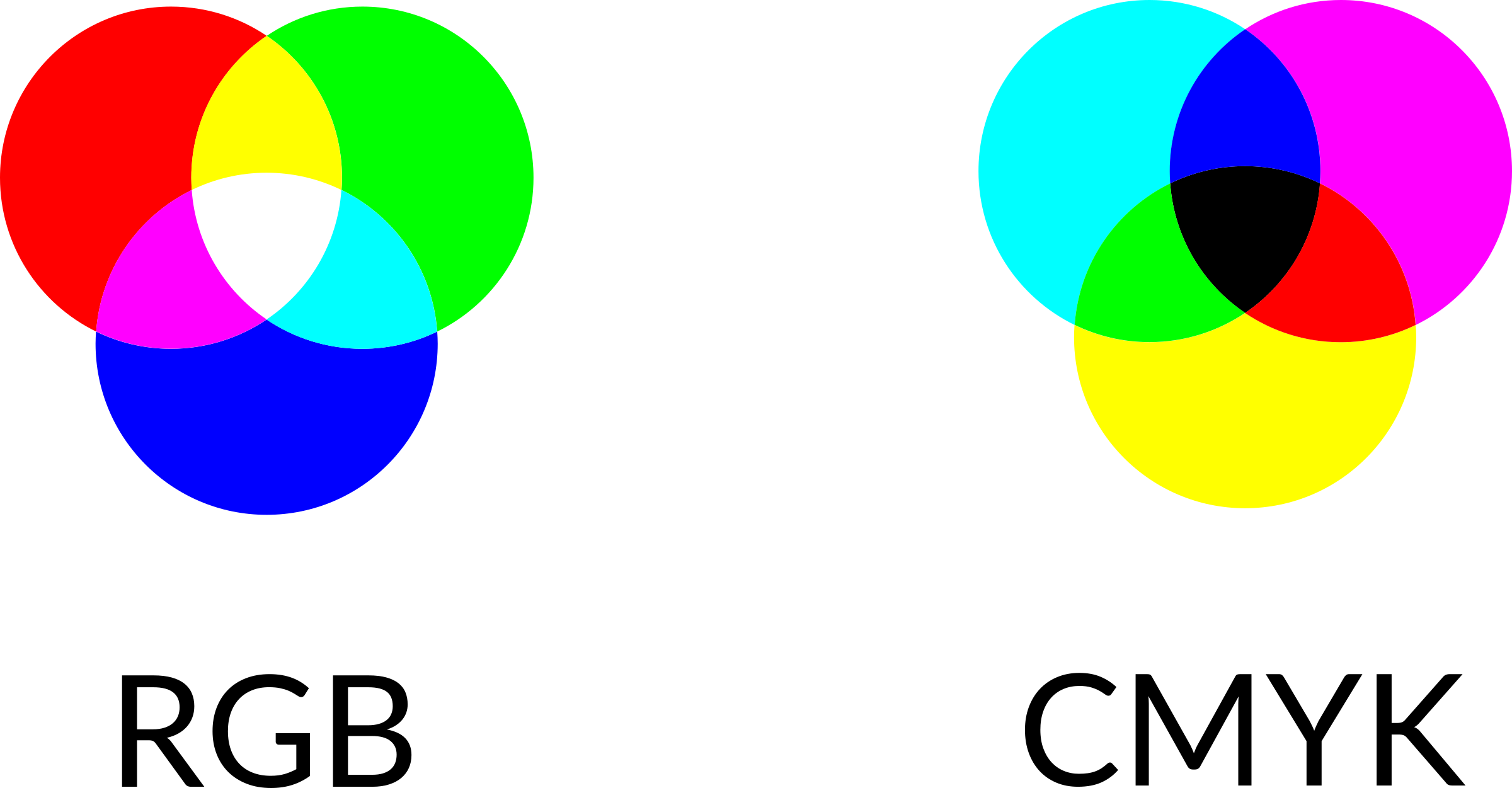
Computer monitors and printers use different colour definitions. Monitors display colours in RGB (Red, Green, Blue) colour mode whereas printers print in CMYK (Cyan, Magenta, Yellow, Black) colour mode. To ensure your printed artwork most closely matches what you see on the screen, we recommend that you upload files in CMYK format. For RGB-formatted files, the printer will attempt to convert the colours to CMYK and could result in a loss of vibrancy.
For Adobe Photoshop users, click Image > Mode > CMYK. For Adobe Illustrator users, click File > Document Colour Mode > CMYK.
Pro tip: The colours produced from monitor to monitor and printer to printer may differ ever so slightly. If you're trying to replicate a specific colour, use the same printer and computer during the design and printing process.
Bleed: 3.175mm (more info)
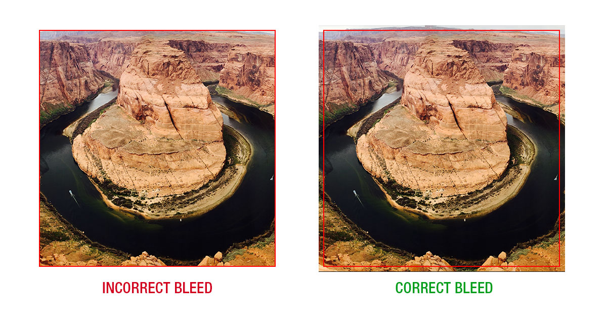
Incorporating a bleed into your file means that your artwork transcends the boundary of your document. Bleeds allow for your design to run to the edge of a page versus having a border of white. We suggest adding a bleed of at least 3.175mm or 1.5875mm to your design. This will help account for any slight movements that occur in the paper tray during the printing process.
Find out how to add a bleed in Maestro Label Designer.
Design and Upload Tips:
Flatten your files.
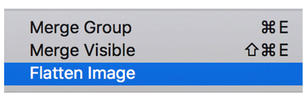
If you're working in a design program, it's important to flatten your layers into a single background layer. This reduces your file size and allows everything to move along more quickly.
Pro tip: Flattening your files means you can no longer make changes to individual layers. Be sure not to save over the original version when flattening if you think you might want to make edits at a later date.
Convert your fonts to outlines.
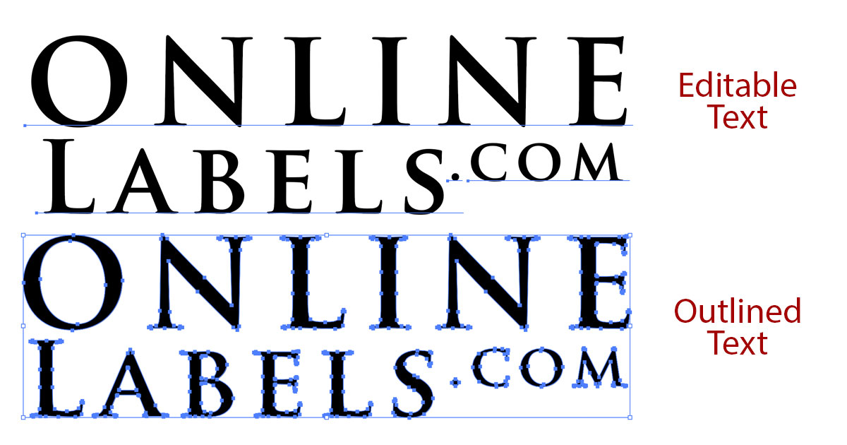
Certain fonts may not translate properly from one machine to another. To ensure your design remains intact, outline your fonts in your design program.
For Adobe Illustrator users, select your text and click Type > Create Outline.
Pro tip: Save a copy of your file without outlined text – outlining it will make it uneditable.
Design for maximum readability.
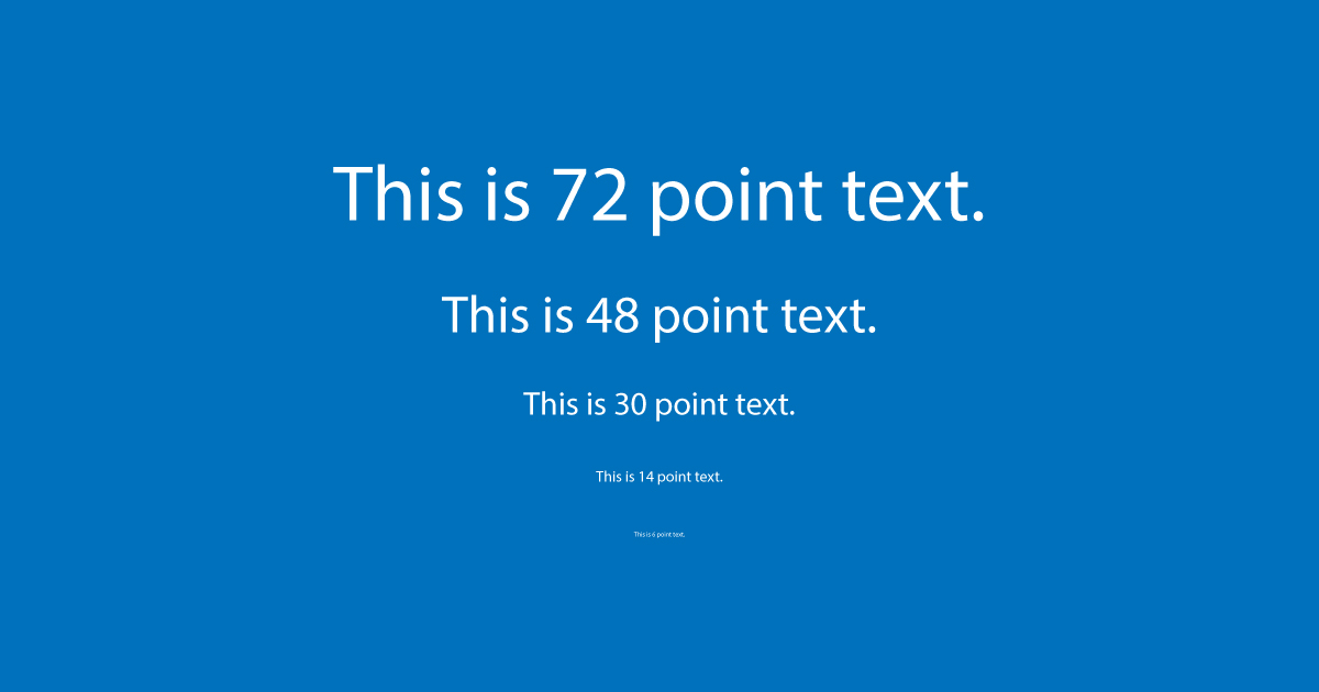
Whether you're designing in Maestro Label Designer or another program, it's important to remember the size you're designing for. Make sure you're viewing your label at 100% size and using text that fits comfortably – stay away from too much text, too small of a font size (we recommend no smaller than 6 pt font), extremely thin fonts, or too light of a text colour.
Include a bleed.
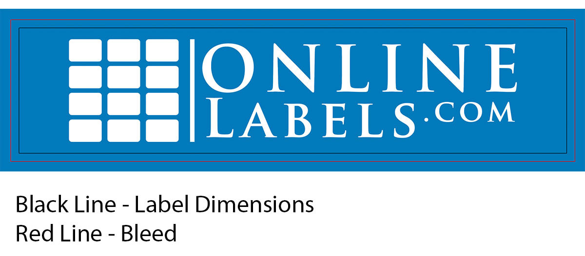
A "bleed" is when you allow your design to transcend the dimensions of the "finished product." Bleeds ensure that once label paper is cut or a label is peeled up from its liner that your desired colour reaches the edge of the label and you don't have any unprinted edges. Bleeds also account for any shifting that occurs throughout the printing process.
Therefore, to ensure your design or background colour prints to the edge of your label, extend the boundary of your design past the boundary of your label. Learn how to add a bleed using Maestro Label Designer.
Work within a safe margin.
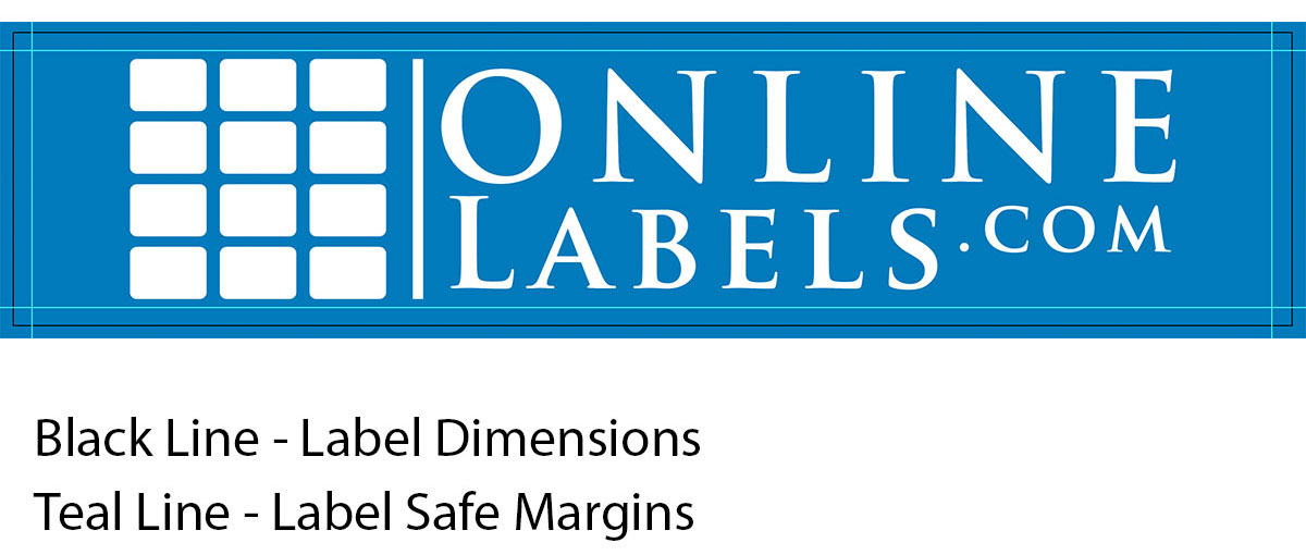
To ensure no valuable information or designs shift during printing and end up outside of the boundary of your label, keep text away from the edge. We recommend leaving at least 3.175mm or 1.5875mm of space on the inside of your label.
Design in CMYK.
Printers using an RGB image will attempt to convert the colours to CMYK, resulting in a loss of vibrancy and a variation from what you saw on-screen.
Use rich black.
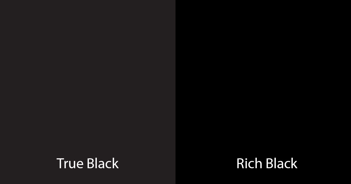
To ensure the blacks in your file print dark enough, use rich black.
To create rich black, use:
Cyan (C): 75
Magenta (M): 68
Yellow (Y): 67
Black (K): 90
To create a rich black in Adobe Photoshop or Illustrator, double click on the colour panels located at the bottom of your tools menu. Once the palette is open, enter the following values into the corresponding letter. C=75, M=68, Y=67, K=90.
To create a rich black in Maestro Label Designer, click on any of the colour palettes located in "Object Properties," "Text Properties," or "Document Properties." In the dialog box that opens, type "000000" into the "Colour Hex" panel textbox.
Don't stretch small images.

Enlarging an image can cause it to become blurry. If possible, use a higher resolution file.
Don't shrink large images.

Shrinking an uploaded image that is too large for your label can also cause some distortion. If possible, use a smaller image that fits your label.
Proof before submitting.
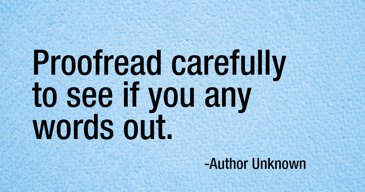
Always check the spelling, layout, and colours in your document before hitting print or submit.
Our image quality guide is designed to take the guesswork out of designing and printing your labels. For more questions related to image uploads in Maestro Label Designer, reach out to our customer service team at 0203 051 9664 or submit a support ticket.