How to Pick the Right Font for Your Label Designs
Who are you selling to?
Different products have different personalities. Not only that, they also have different audiences. It's important to consider this as you're designing your label. A craft beer label is going to speak to a different audience than a handmade sugar scrub. Once you understand your audience, you'll be able to determine the personality of your brand and your buyers.
If your audience is typically older, try using large font that's easy to read. If you have a younger, more modern audience, use a minimalist sans-serif font for a simple, sleek appearance.
What is your brand's personality?
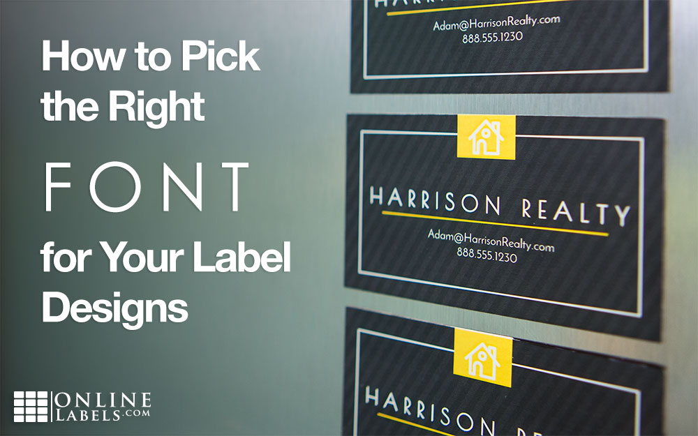
As a brand, you have a story to tell. Tell it through your label and reinforce it with your font choice. It's the perfect way to help tell your story and speak to your audience. Look for inspiration from your company's history, your audience, and from yourself as a business owner. Once you find your own brand's personality, choosing a font to reinforce that will be very easy.
What is your label's message?
What are you trying to say with your label? Is it vital instructions or an eye-catching logo? Your font choice will help you accomplish your goals. If your message needs to be clearly read, use an easy to read font. If it's meant to be something that can catch attention fast, pick something bold and large. This will help it stand out on a shelf when it would otherwise be lost in a sea of products.
We have many fonts available to use with Maestro Label Designer, so you can easily make a label that will work with your product. And don't forget! You get access to Maestro Label Designer with every order. Or, you can purchase subscriptions separately. Want to try it out for yourself? start your free trial today!