How to Create the Best Labels and Packaging Using Colour Psychology [Infographic]
Pick Colours with Purpose
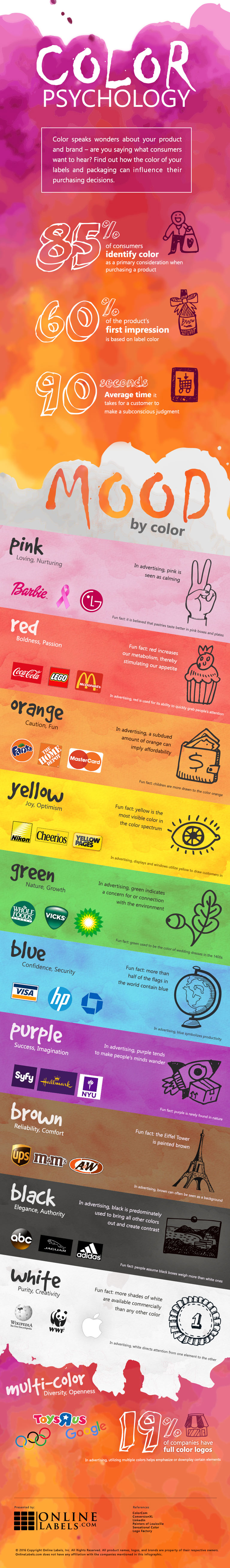
Applying colour psychology to your label design is an easy way to make your brand and product stand out in the marketplace. We've outlined common tips and tricks on utilizing colour theory in your label and packaging design process.
Mix and Match Colours
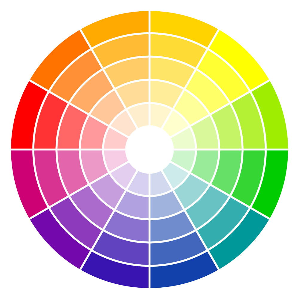
Remember learning about the colour wheel in school? While many haven't had to refer back to it all that often — if at all — in our adult years, recall that complementary colours are those directly opposite each other on the colour wheel whereas analogueous colours are next to each other on the colour wheel. For best results, use complementary colours for a few specific graphic elements or words. They create contrast, making elements "pop." For relaxed visuals that flow together, pair analogueous colours. They work best in the background, differentiating the text from the design.
Play with the Paper Colour
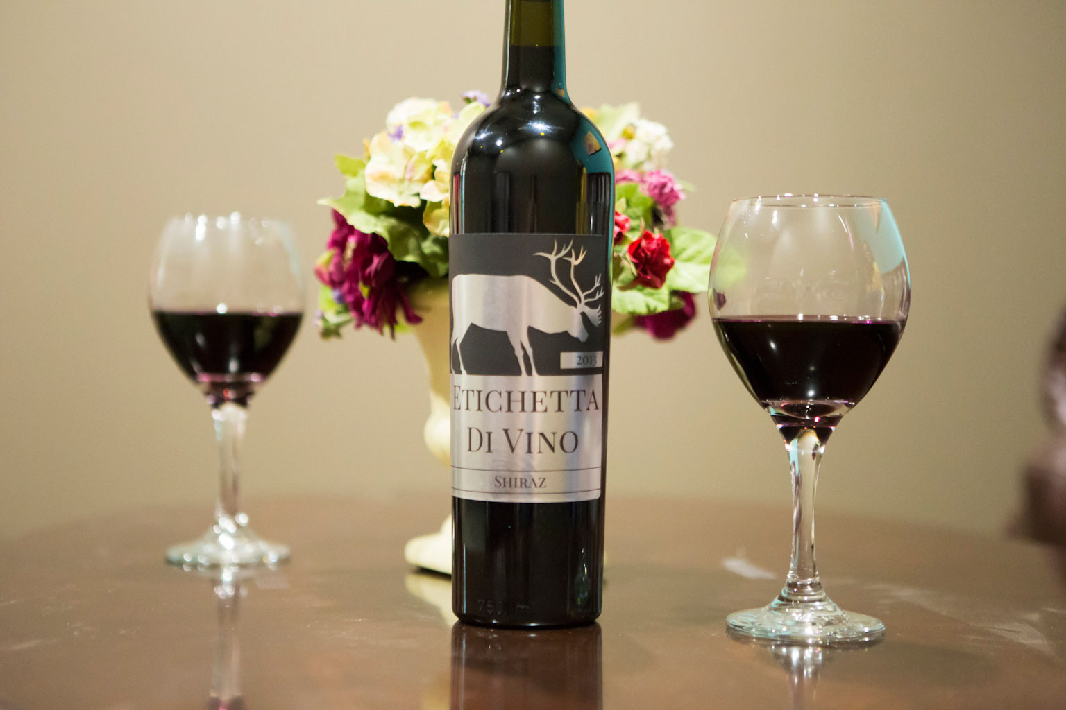
You don't have to rely on your design to make your label something special. There's a world of options out there — labels are available in a variety of different colours and materials, too. Consider how a full-colour label can help increase the perceived worth of your product. Here are some basic uses and associations of uniquely coloured label papers:
Standard Colour Labels
Craving a splash of colour? These labels are both vibrant and subdued, giving your brand the perfect balance of colour and sophistication. Their matt, no gloss finish makes them incredibly versatile — use them to embody a warm and inviting personality or one that's more formal and wintery. With seven choices, the decision is a hard one! Browse our standard label colours.
Metallic Labels
Nothing is more eye-catching on a display than something shiny. Our silver and gold metallic labels radiate quality, making them an ideal option for marketing your premium product. Try using silver to signify glamour and sophistication. It's also been proven to reduce anxiety and bring harmony mentally, physically, and emotionally. Gold on the other hand, while also associated with sophistication, is more symbolic of luxury and quality. It's also said to be more masculine. Check out our metallic label collection to see how it can work for you.
Fluorescent Labels
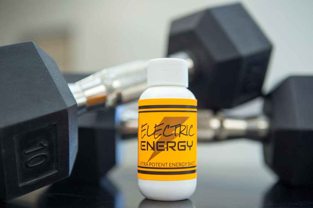
Fluorescent colours, commonly referred to as neons, are great for capturing that extra bit of attention. If you're looking for an upbeat, happy, and loud personality for your product packaging, you've found it with these labels. While best in moderation, fluorescents bring their own light to product packaging and can be very stylish. Perk up your packaging with our fluorescent label assortment.
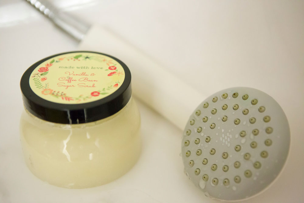
Brown Kraft Labels

For the handmade, natural, or rustic effect, brown paper is as authentic as it gets. The earthy colour can help your product really stand out and is perfect for driving home that made-with-love feel. These labels are also equated with the reliability and comfort that brown represents. Not to mention that if your company works with cardboard, these labels blend right in, creating a seamless appearance. Share the love with our brown kraft label material.
Clear Labels
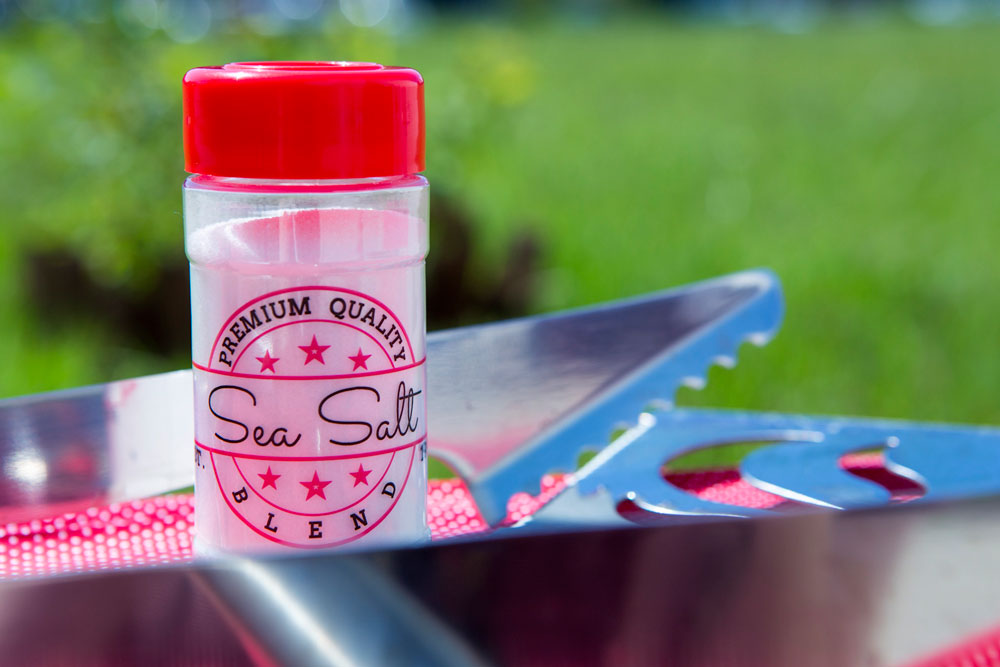
If you want your product or packaging to be at the forefront, a clear or transparent label may be the way to go. The minimalistic approach is a modern trend and an easy way to show your customers that the product is what really matters. It also communicates openness and transparency in your business. Let your labels draw them in and the beauty of your product do the talking. Clear labels work wonders in combination with beauty/cosmetics and food products. Take a look at our clear labels.
Be a Trendsetter
Some of the best successes come from always being one step ahead. If you see a trend on the horizon or want to be a trailblazer, beat your competitors to the punch. Even little things such as playing with the font or adding a pattern can affect the label's performance.
While colour theory is a science, it isn't black and white and your consumers might surprise you. Know that there's no harm in taking a trial run. Try selling a small batch of your big idea or variations of your original product label before going for it all the way. What you see in your head may not convert well to paper, whereas an idea you're sceptical of may translate beautifully. A rebrand can involve a lot of work, and you want to make sure more work equals more sales.
This is a good opportunity to get customer feedback! Share the design on social media and see what people are saying. Do they like the new look? Does it better communicate the personality of your brand and product? Does it stand out more in your displays? Those are all things to consider throughout the process.
There's a whole psychology behind packaging label design and we're just scratching the surface. We hope we've given you insight into how to design a label like a pro and identified ways you can make yours more effective. Now, get started already!