Choosing the Perfect Font For Your Label Design
There are a few unspoken rules in design that most people seem to know, most notably the one referring to Comic Sans. If you're unfamiliar, Comic Sans is an informal, playful font that has become all too prevalent. It has turned into a joke on the Internet, but it also played in important role in drawing attention to the idea that certain fonts are only appropriate for specific purposes. Below, we outline varying typefaces to help you learn how to better brand your product and packaging.
Understanding Font Types
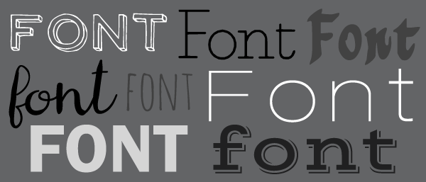
Fonts have personality. Don't believe it? Imagine TIME Magazine's logo in a handwritten, bubbly font instead of its thin, classic one. Fonts can be classy, fun, young, old, straightforward, or loud. And much like everything else, association is perception. If you use a happy-go-lucky font with your sophisticated product, which do you think is going to influence customer perception?
Below is a brief breakdown of the two main font categories.
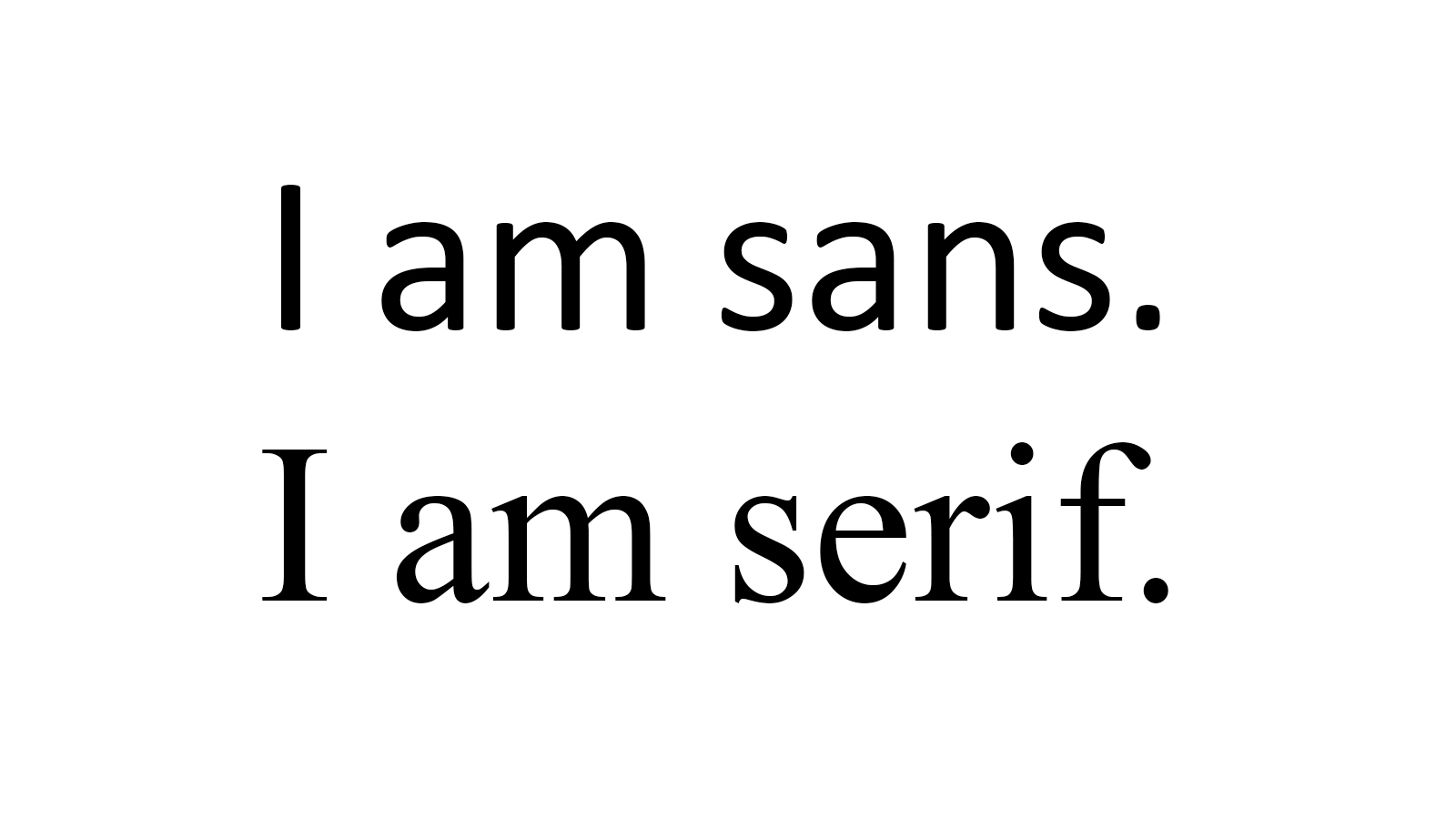 Photo credit: Orkha
Serif
Serif fonts have "feet," the letters are capped off with perpendicular lines. They create a line for the eye to follow making them easier to read. Because of this, they are often used in long passages of text. Serif fonts are among the oldest generation of typefaces, you may recognise Times New Roman as one such font.
Sans Serif
Much like the name implies, sans serif fonts are fonts sans serif, they don't have feet. This simplifies the letters, making them easier to recognise. Sans serif fonts are great for children and those with visual impairments, although they shouldn't be written off if that isn't your target audience. Their lack of feet also represents a more modern style. Arial is a popular, well-known sans serif font.
Questions to Consider
Do you want a typeface that is the font equivalent of a floral shirt and Bermuda shorts or a crisp business suit?
Babar Suleman, Crazy Egg
- What are you labelling? A font perfect for homemade jam may not be the best for business' annual report. Looking at popular trends in your industry is a great way to grasp what's in style and help you decide what defines your product.
- Who is your product for? Narrowing your target demographic should also help determine which font you should use. You want to relate to your audience and make your product more appealing.
- What are you trying to say? Are you wanting something iconic for your logo or to convey important instructions? A clean font will increase the chance that people will not only read it through, but also understand it.
- What does your brand stand for? What do you want your customers to know right off the bat? Pick something relaxing for your spa or safe and secure for your accounting firm.
- Where are you using your font? Knowing the limitations of a font can help rule it out or sanction it for your project. Many fonts aren't considered "web safe," so if you may want to transition your font into your website later, steer clear of specialty, un-safe fonts. (To be web-safe, a font must be common in most operating systems, thereby viewable by most people.)
- Do you plan on using the font in different ways? If you think you might want to keep it in the family, choose a typeface with multiple font options (bold, italic, etc.).
- Where's the type going? If you've already got a busy background in place, employ simplicity in the text. If everything else is muted, feel free to explore intricate, decorative ones.
If you need more help or inspiration, you can always check out our pre-designed templates and Maestro Label Designer for a beginner-friendly design experience. You can also visit a similar font choice article or get inspired by others in our Customer Ideas gallery.