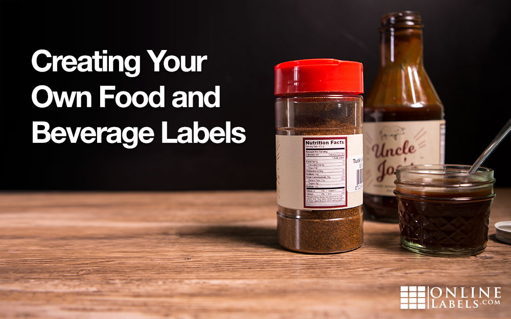
Creating Your Own Food and Beverage Labels
Make your labels look like a big business product without paying those big business prices. We've outlined the best materials, label sizes, design tips, and application techniques to help increase your brand in the eyes of consumers.
Food and Beverage Label Materials
If your products are more likely to sit in a dry cupboard than a refrigerator, any of our permanent adhesive options will ensure your labels last as long as your product. If your bottle or container will be used near liquids or subjected to a change in temperature, we recommend using our weatherproof labels. See below for a few fast facts about each material category.
White Materials
Our white materials are perfect for coloured and transparent containers. The white background provides the perfect space for designing a colourful label and ensures that it won't get lost in the texture, colour, or contents of your food or beverage product. Two of our white material products are also weatherproof / waterproof.
Clear Materials
If you're looking for the “no-label look,” look no further. Our clear materials allow your delicious recipe to do the talking when paired with a clear container. The gloss versions are also seamless, conveying an upscale feel as if you printed directly on your packaging. Be sure to pick one of the weatherproof / waterproof clear label options if your products will be exposed to liquid.
Metallic Materials
Add a little shine to your product with our silver and gold label options. They radiate quality, making them an ideal option for marketing your premium product and catching a few more eyes on the shelves.
Fluorescent Colours
For high-energy product packaging, our neon labels don't disappoint. They're attention grabbing and stylish, perfect for perking up your packaging. Choose from red, orange, yellow, green, and pink.
Standard Colours
Craving a splash of colour but don't want the intensity of neons? These matt labels are colourful without being flamboyant. They're great for adding a splash of colour to your label without overpowering it. Pick from red, orange, yellow, green, blue, pink, and cream.
Miscellaneous Materials
Looking for something rustic, organic, or earthy? Our brown Kraft material feels authentic and looks the part. Use it to label homemade goods or prep cardboard packaging for shipping. Whatever capacity, brown Kraft is great at standing out or blending in.
Pick the Best Label Size and Shape
Do you want a square or circle label for your container? Should it only face the front or would it be better if it wrapped around the sides? Would a snug fit or having some breathing room look better? All of these questions and more are things to consider when picking the shape of your label.
But before you can decide what shape looks best, it's important to figure out your container's dimensions. If your product has any curves, a standard ruler may not give you accurate measurements. If you find yourself in that situation, we recommend downloading our printable ruler and following the instructions that come with it. We've detailed the process in our article, Finding the Right Label Size.
Once you have the height and width figured out, you can move onto the fun part. Be sure to consider the psychological implications of shapes while making your decision. Consider, for instance, that circles are wholesome whereas squares symbolise strength. Browse our selection of jar labels and bottle labels to get started.
Tips for Designing Bottles, Jars, and Food Containers
You want to make sure your labels speak to the nature of your product. Coordinate the look and feel of one with the other. Here are some tips to help make the process a little easier:
- Incorporate your logo colours for brand consistency
- Try script fonts for more high-end products
- Use high contrast colours if you have an older audience for increased readability
- Create visual hierarchy by varying the font sizes — the most important information should be the largest
- Add a textured pattern to the background to drum up visual depth
- Include a shape behind text to both draw attention to it and make it more clear
- Adopt a serif font for older audiences, it's easier to read
- Be wary of including too much information or graphics - white/negative space is a good thing
Print and Apply Your Labels
We want your labels to come out as perfectly as you envision them. We suggest doing a test print on standard printer paper before running your labels through. Lay the practice print on top of the label sheet and hold them up to the light to check for alignment issues. This is the best time to identify and prevent any issues. Read our Troubleshooting Label Printing article for more specifics.
Once you're ready to print your labels, go for it. Let them dry and then place your bottles, jars, or containers on a surface where they won't roll. We've found that placing them in your lap and using your knees to secure them works well. Remove the protective backing and align the label where you'd like it. Start the application at the centre of the label and then move your fingers toward the edges. Once you're happy with the placement, eliminate any air pockets or creases and apply more force for the best adherence.
Put your product's best foot forward with a label that looks professional and appealing. Use Maestro Label Designer for a user-friendly design programme or get started with our selection of pre-designed jar, wine, beer, and water bottle labels. With Online Labels, you can design and print high quality jar and bottle labels without going over budget.